使用ECharts和G2实现图表
在网页上常用的图表显示框架有ECharts、G2等,通过使用ECharts和G2实现相同效果的双折线带面积的图表来学习其用法。
ECharts
ECharts绘制图表通过设置options来实现,并通过setOption来应用配置项,同时实现图表的更新。
安装ECharts
npm install echarts
获取容器
首先在template中准备一个定义了宽高的DOM容器,并通过ref创建引用,在script中定义该引用变量,获取组件,通过echarts.init方法初始化一个实例,并将其绑定在组件上,之后通过setOption方法生成图表。
<template>
	<div ref="myCanvas" style="width: 450px;height: 350px"></div>
</template>

<script setup>
import { ref, onMounted } from 'vue'
import * as echarts from 'echarts'

const myCanvas = ref()

onMounted(() => {
  let echart = echarts.init(myCanvas.value)
  echart.setOption(option)
}
</script>
定义Option
创建一个变量option用于指定图表的配置项和数据
const option = {
  // x轴的相关配置
  // type=‘category’表明该轴的数据类型是离散的类目数据
  // data中定义了该轴的相关数据
  xAxis: {
    type: 'category',
    data: ['Mon', 'Tue', 'Wed', 'Thu', 'Fri', 'Sat', 'Sun']
  },
  // y轴的相关配置
  // type=‘value’表明该轴的数据类型是连续数据
  yAxis: {
    type: 'value'
  },
  // 图例的相关配置
  // data表明存在两条折线,应显示两个图例
  // bottom=0表明图例应显示在图表底部
  legend: {
    data: ['total', 'fans'],
    bottom: 0
  },
  // 提示框的相关配置
  // trigger=axis表明提示框由坐标轴触发,即鼠标在坐标轴上时即可显示,如为
  // ‘item’则只在数据点上触发(点与点之间的连线则不触发)
  // triggerOn=‘mousemove|click’表明在鼠标移动和点击时都会触发
  tooltip: {
    trigger: 'axis',
    triggerOn: 'mousemove|click'
  },
  // 数据的配置
  // series传递一个数组,每个对象对应一条折线
  series: [
    {
      // data:该折线的数据值
      // type:line表明该数据是折线图
      // name:该折线的名称,与图例中名称相对应
      // color:折线的颜色
      // areaStyle:用于配置折线面积的样式
      data: [820, 932, 901, 934, 1290, 1330, 1320],
      type: 'line',
      name: 'total',
      color: '#ff4684',
      areaStyle: {
        // 背景色通过线性渐变函数获取渐变色
        // 前四个参数分别表示渐变的起始x,y位置,和终止的x,y位置(百分比)
        // 最后一个参数设置渐变各个位置的颜色
        color: new echarts.graphic.LinearGradient(0, 0, 0, 1, [
          {
            offset: 0,
            color: '#ff468433'
          },
          {
            offset: 1,
            color: '#ff468400'
          }
        ])
      }
    },
    {
      data: [145, 245, 123, 425, 134, 312, 175],
      type: 'line',
      name: 'fans',
      color: '#00aeec',
      // 折线样式的配置
      // color:折线颜色
      // width:折线宽度
      // type:折线样式
      lineStyle: {
        color: '#00aeec',
        width: 2,
        type: 'dashed'
      },
      areaStyle: {
        color: new echarts.graphic.LinearGradient(0, 0, 0, 1, [
          {
            offset: 0,
            color: '#00aeec33'
          },
          {
            offset: 1,
            color: '#00aeec00'
          }
        ])
      }
    }
  ]
};
完整代码
<template>
	<div ref="myCanvas" style="width: 450px;height: 350px"></div>
</template>

<script setup>
import { ref, onMounted } from 'vue'
import * as echarts from 'echarts'

const myCanvas = ref()
const option = {
  xAxis: {
    type: 'category',
    data: ['Mon', 'Tue', 'Wed', 'Thu', 'Fri', 'Sat', 'Sun']
  },
  yAxis: {
    type: 'value'
  },
  legend: {
    data: ['total', 'fans'],
    bottom: 0
  },
  tooltip: {
    trigger: 'axis',
    show: true,
    showContent: true,
    triggerOn: 'mousemove|click'
  },
  series: [
    {
      data: [820, 932, 901, 934, 1290, 1330, 1320],
      type: 'line',
      name: 'total',
      color: '#ff4684',
      areaStyle: {
        color: new echarts.graphic.LinearGradient(0, 0, 0, 1, [
          {
            offset: 0,
            color: '#ff468433'
          },
          {
            offset: 1,
            color: '#ff468400'
          }
        ])
      }
    },
    {
      data: [145, 245, 123, 425, 134, 312, 175],
      type: 'line',
      name: 'fans',
      color: '#00aeec',
      lineStyle: {
        color: '#00aeec',
        width: 2,
        type: 'dashed'
      },
      areaStyle: {
        color: new echarts.graphic.LinearGradient(0, 0, 0, 1, [
          {
            offset: 0,
            color: '#00aeec33'
          },
          {
            offset: 1,
            color: '#00aeec00'
          }
        ])
      }
    }
  ]
};

onMounted(() => {
  let echart = echarts.init(myCanvas.value)
  echart.setOption(option)
}
</script>
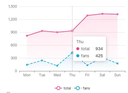
呈现效果
G2
G2图表的绘制同样通过配置项来进行设置,将配置项作为初始化时的一个参数传入,之后调用渲染函数进行绘制。
安装G2
npm install @antv/g2plot
创建容器
首先在template中准备一个定义了宽高的DOM容器,并通过ref创建引用,在script中定义该引用变量,获取组件
<template>
	<div ref="myCanvasG2" width="450px" height="350px"></div>
</template>
引入数据
const data = [{
  time: 'Mon',
  value: 10,
  type: '预期收益率'
}, {
  time: 'Tue',
  value: 22,
  type: '预期收益率'
}, {
  time: 'Wed',
  value: 16,
  type: '预期收益率'
}, {
  time: 'Thu',
  value: 26,
  type: '预期收益率'
}, {
  time: 'Fri',
  value: 12,
  type: '预期收益率'
}, {
  time: 'Sat',
  value: 26,
  type: '预期收益率'
}, {
  time: 'Sun',
  value: 18,
  type: '预期收益率'
}, {
  time: 'Mon',
  value: 4,
  type: '实际收益率'
}, {
  time: 'Tue',
  value: 3,
  type: '实际收益率'
}, {
  time: 'Wed',
  value: 6,
  type: '实际收益率'
}, {
  time: 'Thu',
  value: 12,
  type: '实际收益率'
}, {
  time: 'Fri',
  value: 1,
  type: '实际收益率'
}, {
  time: 'Sat',
  value: 9,
  type: '实际收益率'
}, {
  time: 'Sun',
  value: 13,
  type: '实际收益率'
}]
创建并渲染图表
与ECharts不同的是,G2需要根据不同的图表,引入不同的图表类,例如使用面积图则import { Area } from '@antv/g2plot',使用折线图则引入import { Line } from '@antv/g2plot'
import { Area } from '@antv/g2plot'
import { ref, onMounted } from 'vue'

const myCanvasG2 = ref()

onMounted(()=>{
  let gchart = new Area(myCanvasG2.value,g2Options)
  gchart.render()
})
定义配置项
定义一个option变量用于指定图表的配置项和数据
const colors = ['#ff4684', '#00aeec']
const g2Options = {
  // 引入数据
  data,
  // 定义x轴使用的数据字段
  xField: 'time',
  // 定义y轴使用的数据字段
  yField: 'value',
  // 定义分组的依据字段
  seriesField: 'type',
  // 配置折线的颜色,传入数组则是多条不同折线的颜色,详见文档
  color: colors,
  // 配置折线的样式
  // 如果type是‘实际收益率’则显示为虚线
  // 函数返回的应是整个lineStyle对象的配置内容,具体配置内容见文档,函数中传入
  // 的参数为整个图表的数据
  line: {
    style: (data) => {
      if (data['type'] === '实际收益率') {
        return {
          lineDash: [4, 4]
        }
      }
    },
  },
  // 提示框的配置项
  // showCrosshairs=true表明显示crosshairs
  // crosshairs设置crosshairs的样式
  tooltip: {
    showCrosshairs: true,
    // type=xy表明在x方向和y方向上都显示辅助线
    // line用于设置该辅助线的样式
    crosshairs: {
      type: 'xy',
      line: {
        style: {
          stroke: '#ff4684',
          lineDash: [4, 4]
        }
      }
    },
  },
  // 折线面积的配置
  // 同样根据数据中的type字段来分别显示不同的样式
  // 渐变格式为 l(角度) 位置:颜色
  areaStyle: (data) => {
    if(data['type'] === '实际收益率'){
      return {
        fill: 'l(90) 0:#00aeec88 1:#00aeec00'
      }
    }
    return {
      fill: 'l(90) 0:#ff468488 1:#ff468400'
    }
  },
  // 图例的配置
  // position:‘bottom’表明图例显示在底部
  legend: {
    position: 'bottom',
  },
}
完整代码
<template>
	<div ref="myCanvasG2" width="450px" height="350px"></div>
</template>

<script setup>
import { Area } from '@antv/g2plot'
import { ref, onMounted } from 'vue'

const myCanvasG2 = ref()
const colors = ['#ff4684', '#00aeec']
const g2Options = {
  // 引入数据
  data,
  // 定义x轴使用的数据字段
  xField: 'time',
  // 定义y轴使用的数据字段
  yField: 'value',
  // 定义分组的依据字段
  seriesField: 'type',
  // 配置折线的颜色,传入数组则是多条不同折线的颜色,详见文档
  color: colors,
  // 配置折线的样式
  // 如果type是‘实际收益率’则显示为虚线
  // 函数返回的应是整个lineStyle对象的配置内容,具体配置内容见文档,函数中传入
  // 的参数为整个图表的数据
  line: {
    style: (data) => {
      if (data['type'] === '实际收益率') {
        return {
          lineDash: [4, 4]
        }
      }
    },
  },
  // 提示框的配置项
  // showCrosshairs=true表明显示crosshairs
  // crosshairs设置crosshairs的样式
  tooltip: {
    showCrosshairs: true,
    // type=xy表明在x方向和y方向上都显示辅助线
    // line用于设置该辅助线的样式
    crosshairs: {
      type: 'xy',
      line: {
        style: {
          stroke: '#ff4684',
          lineDash: [4, 4]
        }
      }
    },
  },
  // 折线面积的配置
  // 同样根据数据中的type字段来分别显示不同的样式
  // 渐变格式为 l(角度) 位置:颜色
  areaStyle: (data) => {
    if(data['type'] === '实际收益率'){
      return {
        fill: 'l(90) 0:#00aeec88 1:#00aeec00'
      }
    }
    return {
      fill: 'l(90) 0:#ff468488 1:#ff468400'
    }
  },
  // 图例的配置
  // position:‘bottom’表明图例显示在底部
  legend: {
    position: 'bottom',
  },
}

onMounted(()=>{
  let gchart = new Area(myCanvasG2.value,g2Options)
  gchart.render()
})
</script>
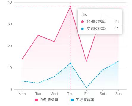
呈现效果
遇到的问题
在设置Tooltip的过程中遇到一个ECharts的Tooltip不显示原因
Reference
 2024
2024