实现一个门票、卡券样式的卡片,涉及到mask-image,drop-shadow,radial-gradient等属性的学习与使用
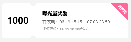
实现一个门票、卡券样式的卡片,其样式如下所示:
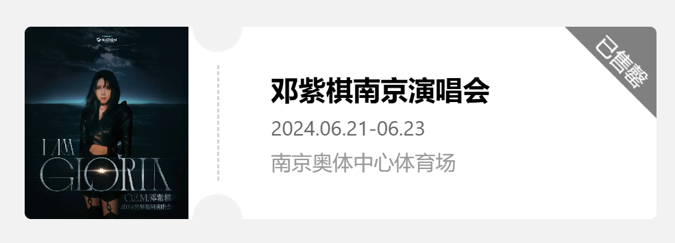
可以发现这个样式以虚线为界分为左右两个部分,左侧显示图片,右侧显示一些详细信息,其中右上角还有一个三角模块显示当前状态。
基础布局
左侧的图片,右侧的详细信息布局都可以轻松完成,中间的虚线则使用border进行设置
- 新建一个空标签
- 设置其
border-left属性,将样式设置为dashed实现虚线条 - 设置上下的
margin来将虚线放置在中间
虚线上下的半圆缺口
首先通过radial-gradient实现一个径向渐变,指定渐变的形状,大小,圆心和渐变颜色位置
radial-gradient(circle 100px at 200px 75px,transparent 19% red 20%);
上述css样式意为,创建一个半径为100px,圆心位置在(200px,75px)的径向渐变,其中圆心到19%处为透明,19%到20%处为透明到红色的渐变,20%到100%为红色
通过将这一个渐变图案赋值给mask-image实现遮罩效果
mask-image:radial-gradient(circle 100px at 200px 75px,transparent 19% red 20%);
mask-image接收一个图片,可以是通过url传入的图片,也可以是通过radial-gradient等方法创建的图形,传入的图片中的透明部分(transparent)会被遮挡,显示下方元素,而非透明的部分则会进行显示,从而实现不同形状的蒙版。
此时,我们已经创建了一个圆形蒙版,得到了一个半径为100px的圆形,圆形内显示的是背景样式,为了实现上下的缺口,我们需要对蒙版进行移动,使用mask-position属性对蒙版进行定位。
并且这个蒙版会在该元素内循环定位,也就是说如果我们将这个图形移出边界,那么移出的那部分会出现在该元素的另一侧,所以我们通过将这个圆形蒙版下移或上移一半,使得只留下半圆,那么剩下的半圆便会出现在另一侧,从而实现上下两个半圆的缺口。
mask-image: radial-gradient(circle 100px at 200px 75px, transparent 19%, red 20%);
mask-position: -50px 75px;
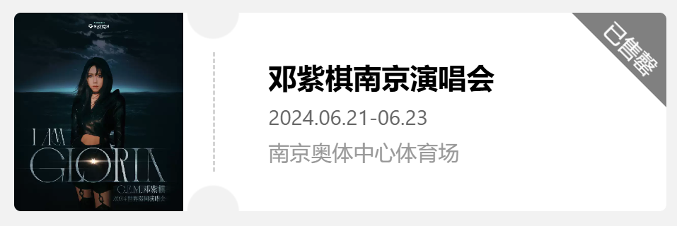
右上角三角标签
比起构建一个三角形的形状,更常用的方法是正常设置一个正方形的元素,将其旋转后移动至右上角,并隐藏溢出的部分。
.ticket-card__tag{
  width: 106px;
  height: 106px;
  background: gray;
  color: white;
  display: flex;
  align-items: end;
  justify-content: center;
  transform: rotate(45deg);
  position: absolute;
  top: -55px;
  right: -55px;
  line-height: 25px;
}
设置大小背景色和文字的位置后通过 transform: rotate(45deg)将图形旋转45度,之后通过设置 position: absolute;和top、right属性将其移动到右上角,实现标签的显示。并且由于已经给父元素添加了蒙版,所以标签溢出的部分会直接被蒙版所遮盖,只显示一个三角。
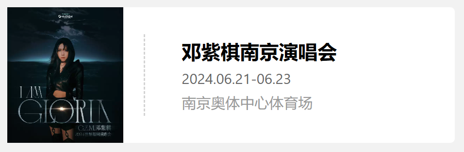
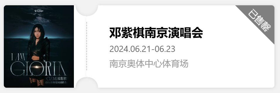
通过这种方式我们已经可以实现门票、卡券样式的显示,例如BiliBili的流量券样式
另一种实现方式,支持阴影
但通过上述方式实现,我们会发现一个问题,就是如果我们想要给这个卡片添加一个阴影,但发现由于阴影被遮罩所覆盖而无法显示。
因此我们考虑通过拼接的方式实现该样式,左侧为一个带右上和右下缺口的元素,中间一个虚线,右侧则为一个带左上和左下缺口的元素。三者拼接实现卡券样式。
左右侧卡片
首先是左侧的卡片,同样使用radial-gradient创建圆形图案,在background属性中通过设置两个radial-gradient来添加两个圆。
background: radial-gradient(circle 100px at right top, transparent 19%, white 20%) top right / 100% 51% no-repeat,
            radial-gradient(circle 100px at right bottom, transparent 19%, white 20%) bottom right/ 100% 51% no-repeat;
- 首先通过
circle 100px at right top, transparent 19%, white 20%设置一个半径为100px,圆心位于右上角的径向渐变,从而得到一个1/4圆的形状,然后设置渐变色,从圆心到19%处为透明,显示背景颜色,从19%到20%处为透明到白色的渐变,从20%到100%为白色 - 通过
top和right指定该块背景的位置在右上角,之后的100% 51%指定该块背景的大小,例如如果设置为top right / 50% 50%,那么这块背景就只占据元素右上角且面积为元素的1/4,如果设置为top / 50% 50%,那么这块背景就只占据元素的上半部分,且居中,大小仍为元素的1/4 - 如果这里不添加背景的位置和大小,那么它会默认占据100%的大小,就会出现第一个渐变中的透明部分,被第二个渐变的白色所覆盖,同理第二个渐变的透明部分显示的也是第一个渐变的白色部分,则无法实现缺口效果了。
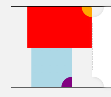
上图即为下方代码的示例
background: radial-gradient(circle 100px at right top, orange 19%, red 20%) top right / 80% 51% no-repeat,
      radial-gradient(circle 100px at right bottom, purple 19%, lightblue 20%) bottom / 50% 51% no-repeat;
那么接下来右侧卡片也就同理了,只需要将缺口设置为左上角和左下角即可。
.ticket-card__content{
  width: 300px;
  padding-left: 40px;
  background: radial-gradient(circle 100px at left top, transparent 19%, white 20%) top left / 100% 51% no-repeat,
              radial-gradient(circle 100px at left bottom, transparent 19%, white 20%) bottom left / 100% 51% no-repeat;
  border-radius: 5px;
  display: flex;
  flex-direction: column;
  justify-content: center;
  overflow: hidden;
  position: relative;
}
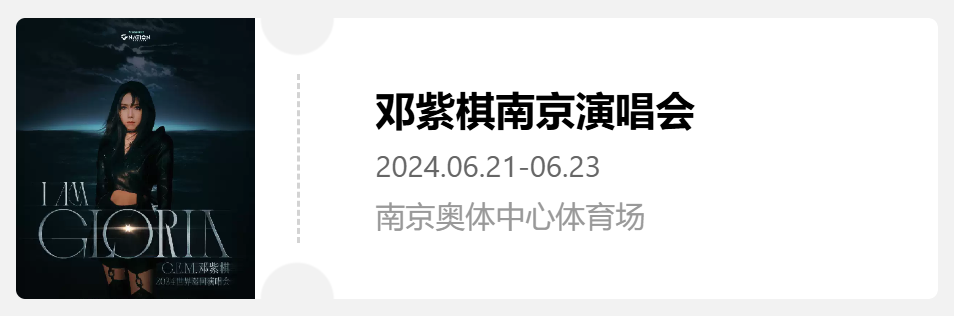
这样便实现了之前的样式效果。
接下来如果想要给这个不规则图形添加一个阴影的话就需要用到filter 中的drop-shadow,分别给左右两个部分添加这一样式即可实现阴影。注意drop-shadow跟box-shadow的区别
filter: drop-shadow(1px 1px 3px lightgray);
实现代码
第一种方式
<template>
    <div class="ticket-card">
      <div class="ticket-card__title_container">
        <div class="ticket-card__title"></div>
      </div>
      <div class="ticket-card__divider"></div>
      <div class="ticket-card__content">
        <span class="ticket-card__content__title">邓紫棋南京演唱会</span>
        <span class="ticket-card__content__time">2024.06.21-06.23</span>
        <span class="ticket-card__content__place">南京奥体中心体育场</span>
      </div>
      <div class="ticket-card__tag">
        已售罄
      </div>
    </div>
</template>

<script lang="ts" setup>
</script>

<style>
body{
  background-color: rgb(242,242,242);
}

.ticket-card{
  mask-image: radial-gradient(circle 100px at 200px 75px, transparent 19%, red 20%);
  mask-position: -50px 75px;
  width: fit-content;
  height: 150px;
  background: white;
  position: relative;
  border-radius: 5px;
  display: flex;
}

.ticket-card__title_container{
  width: 150px;
  overflow: hidden;
}

.ticket-card__title{
  width: 85%;
  height: 100%;
  display: flex;
  justify-content: center;
  align-items: center;
  background: url('https://img.dahepiao.com/uploads/allimg/240607/39222-PbS0y9xfEuEbf.jpg') no-repeat;
  background-size: 100%;
}

.ticket-card__divider{
  border-left: 2px dashed lightgray;
  margin: 30px 0px;
}

.ticket-card__content{
  width: 300px;
  padding-left: 40px;
  display: flex;
  flex-direction: column;
  justify-content: center;
}

.ticket-card__content__title{
  font-weight: 700;
  font-size: 16pt;
  color: #000;
  margin-bottom: 10px;
}

.ticket-card__content__time{
  font-size: 12pt;
  line-height: .768rem;
  color: #666;
  margin-bottom: 10px;
}

.ticket-card__content__place{
  font-size: 12pt;
  color: #999;
  word-break: break-all;
  overflow-wrap: break-word;
}

.ticket-card__tag{
  width: 106px;
  height: 106px;
  background: gray;
  /* text-align: center; */
  color: white;
  display: flex;
  align-items: end;
  justify-content: center;
  transform: rotate(45deg);
  position: absolute;
  top: -55px;
  right: -55px;
  line-height: 25px;
}
</style>
第二种修改的部分
<template>
    <div class="ticket-card">
      <div class="ticket-card__title__container">
        <div class="ticket-card__title"></div>
      </div>
      <div style="background-color: white;margin:20px 0px;width:2px;z-index: 1;">
        <div class="ticket-card__divider"></div>
      </div>
      <div class="ticket-card__content">
        <span class="ticket-card__content__title">邓紫棋南京演唱会</span>
        <span class="ticket-card__content__time">2024.06.21-06.23</span>
        <span class="ticket-card__content__place">南京奥体中心体育场</span>
        <div class="ticket-card__tag">
          已售罄
        </div>
      </div>
    </div>
</template>


<style>
.ticket-card{
  width: fit-content;
  height: 150px;
  position: relative;
  display: flex;
  margin: 40px 0px 0px 40px;
}

.ticket-card__title__container{
  width: 150px;
  height: 150px;
  background: radial-gradient(circle 100px at right top, transparent 19%, white 20%) top right / 100% 51% no-repeat,radial-gradient(circle 100px at right bottom, transparent 19%, white 20%) bottom right / 100% 51% no-repeat;
  border-radius: 5px;
  overflow: hidden;
  filter: drop-shadow(1px 1px 3px lightgray);
}

.ticket-card__content{
  width: 300px;
  padding-left: 40px;
  background: radial-gradient(circle 100px at left top, transparent 19%, white 20%) top left / 100% 51% no-repeat,radial-gradient(circle 100px at left bottom, transparent 19%, white 20%) bottom left / 100% 51% no-repeat;
  border-radius: 5px;
  display: flex;
  flex-direction: column;
  justify-content: center;
  overflow: hidden;
  position: relative;
  filter: drop-shadow(1px 1px 3px lightgray);
}
</style>
 2024
2024